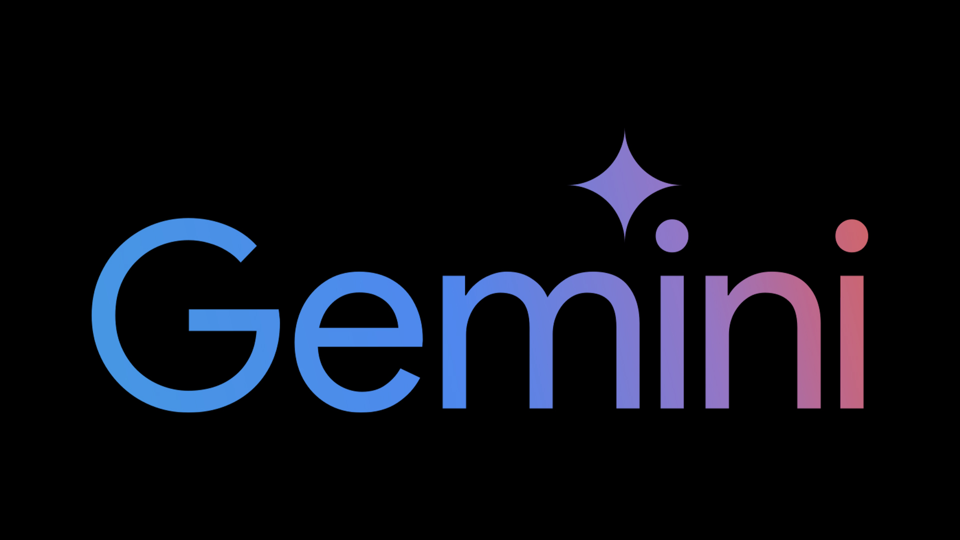
🚀 Exciting News! Google’s new Gemini logo feels like part of the family after a small tweak 🎨✨
)$/
After years of feeling isolated, the blue and purple colors gave it a unique vibe. Now, they’ve blended Google’s signature red, yellow, green, and blue to create something cohesive and familiar. It’s like the logo finally *gets* what Google is all about! 🌟
The new design has a gradient that adds softness while keeping the star shape recognizable. Plus, it feels more integrated with Google’s brand identity—it’s not just an AI logo anymore! 😊
✨ Love this subtle change? Follow for more design updates and inspiration. Let us know your thoughts in the comments below!
#LogoUpdate #Google #DesignNews #GeminiLogo #BrandIdentity #CreativeBloq #Web3Tech

